A fintech founder once told me: ‘We made saving money as easy as buying a coffee. People still don’t save.’ She was genuinely puzzled. The UX was beautiful, the interest rate was competitive, onboarding took thirty seconds. Sign-ups were strong. Three months later, 70% of accounts had a balance of zero.
This is the fundamental misunderstanding that most fintech products are built on. They solve the friction problem brilliantly: fewer clicks, faster setup, smoother interfaces. But saving money and signing up for a savings app are two completely different psychological actions. Signing up requires a single moment of motivation. Saving requires overcoming present bias every single day. It requires accepting the felt loss of a transfer. It requires trusting a new platform with money that feels very real.
Ask users what they want from a fintech app and they say “simplicity” and “transparency.” But the job they actually want done is something different: the feeling that they are moving towards financial freedom, without having to think about it actively every day. They want the result. They do not want to have to perform the behaviour that produces the result.
At SUE, I’ve worked with fintech companies that had solved every UX problem and still couldn’t get users to change their financial behaviour. The product was never the issue. The psychology was.
Behavioural design for fintech applies behavioural science to saving, investing, and financial decision-making. Instead of adding more features or gamification mechanics, it maps the psychological forces that block financial action. Using the SUE | Influence Framework©, fintech companies redesign saving flows, investment journeys, and financial interfaces to work with human psychology rather than against it.
The numbers behind the financial behaviour gap
The job users want done: the real starting point
If you ask fintech users why they download a savings or investment app, they say “save more easily,” “get more control over my money” or “start investing.” But if you look at what they actually want done, you find something deeper. They want the feeling that their financial future is sorted without needing to spend daily time and mental energy on it. They want to remove the anxiety of financially lagging behind their peers. They want control without complexity.
That is the job. And if you understand it, you understand why most fintech products do not do that job. They deliver tools, not results. They provide features, not a feeling of progress. And the feeling of progress, the sense that you have already started, are already underway, already ahead, is what keeps behaviour going.[5]
“Simplicity eats willpower for breakfast.”
The Art of Designing Behaviour (2024)
Every second a user has to actively think about what they are doing, every form field they have to fill in, every choice they have to make, eats into the mental energy they were trying to save for their job. The fintech product that best does the job ‘feeling financially sorted’ is the one that takes the most off the user’s plate. Not the product with the most features. The product with the fewest decisions.
Why fintech needs behavioural design
The fintech industry was built on a seductive premise: make financial services frictionless and people will use them better. Remove the legacy bank branch, the slow transfer, the opaque fee structure. Put the power in a beautifully designed app. And users will naturally save more, invest more intelligently, and achieve financial wellbeing.
That premise is wrong. Not because the products are bad. Because human beings are not rational financial actors. They never were.
We know from decades of behavioural economics research that people systematically discount future gains, overweight immediate losses, anchor to the wrong numbers, and default to doing nothing when overwhelmed by choice. Bunq, Revolut, N26, Wise: all of them have solved the product design problem. The challenge that remains unsolved is the behaviour design problem. How do you get someone to actually use a product that genuinely serves their interests?
The onboarding funnel is not the behaviour funnel. Optimising conversion is not the same as designing financial behaviour.
Richard Thaler understood this long before fintech existed. His Save More Tomorrow programme, designed with Shlomo Benartzi, didn’t ask people to save more now. It asked them to commit today to saving from future pay increases. The result: savings rates quadrupled.[6] Not because of a better product. Because of a better understanding of how people actually make decisions. As we argue in The Art of Designing Behaviour (2024): you don’t change behaviour by changing the person. You change behaviour by changing the environment in which decisions are made.
Three fintech challenges that behavioural design solves
Challenge 1: the €0 account
A savings app had strong download numbers and a smooth onboarding flow. Users set up their account, chose a savings goal, and were shown a projected balance in 12 months. The product team celebrated. Three weeks later, 68% of accounts had never received a single deposit. The team’s response was to send more push notifications. Notification open rates fell. Deposits didn’t rise.
Because notifications were not the problem.
The real barrier was a combination of present bias (spending feels immediate and concrete; saving feels abstract and distant), loss aversion (transferring money to a savings account feels like losing it, even temporarily), and pure inertia. The user had to actively initiate a transfer. Doing nothing was effortless. Every day of doing nothing was a fresh opportunity for inertia to win.
What the onboarding was also missing was a sense of already having started. Nunes and Dreze showed that when people feel they have already made progress on a goal, they are significantly more likely to continue than when they start from zero.[7] That is the Endowed Progress Effect: give users two stamps on their loyalty card before they buy their first coffee. In fintech, it translates to: let users close the app feeling they have already begun, not that there is still something they need to do later.
Challenge 2: panic selling at the worst moment
A retail investing platform saw a troubling pattern after its first major market correction. Users who had held diversified portfolios for months suddenly began selling at exactly the wrong moment, locking in losses that would have been recovered within eight weeks. Support tickets spiked. Churn spiked. The product team read feedback suggesting users felt “out of control” and “surprised” by normal volatility.
This is loss aversion in its most financially damaging form. First-time investors check their portfolio daily, because the app makes checking frictionless. Every red number triggers the same threat response that evolved to help humans avoid physical danger. The loss feels larger than an equivalent gain would feel good. And the only way to make the bad feeling stop is to sell.
Robinhood’s design, with its confetti, its frictionless trading, and its instant portfolio visibility, was optimised for engagement. It was not optimised for investor outcomes. The two are not the same thing. Betterment took a different approach, deliberately foregrounding long-term trajectory and making the daily balance harder to reach, and their user outcomes reflected it. The contrast illustrates a core principle from The Art of Designing Behaviour: “Influence is far more judo than karate.” You do not fight loss aversion head-on. You change what the user sees first.
Challenge 3: financial education nobody reads
Regulators across Europe and the US require fintech companies to ensure users are financially informed before making investment decisions. Every product has a risk disclaimer. Many have educational content sections, glossaries, explainer videos. Average engagement: 2%. Users scroll past warnings, tap “I understand” on risk disclosures they haven’t read, and proceed to make decisions they don’t fully understand.
This is not a user education problem. It is a design problem. Putting financial education in a separate “Learn” section assumes users will seek it out when curious. They won’t. Information presented at the wrong moment has zero effect on behaviour at the moment that matters. “What people say and what people do are two fundamentally different things,” as we write in The Art of Designing Behaviour. Users say financial education is important. They don’t read it. That is not a failure of the user. It is an instruction for the design.
Influence Framework analysis: what drives and blocks financial behaviour
The SUE | Influence Framework© always starts with the job: what does the user want done in their life? In fintech, the central job for most users is not ‘optimise my money.’ It is ‘feel financially secure without constantly having to actively manage it.’ Only when you understand the job do you understand which Pains and Gains actually drive behaviour, and which Comforts and Anxieties block it. Applied to fintech, the pattern is consistent and largely unaddressed by standard product design: blocking forces are stronger than driving forces, and they operate below the level of rational awareness.
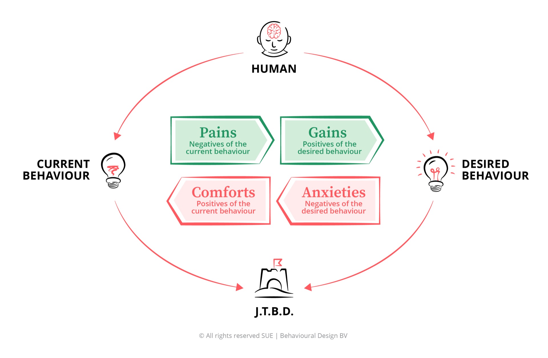
Why fintech users intend to save but never actually do
Fintech marketing addresses driving forces effectively. Users feel the pain of financial insecurity, want the gain of financial freedom, and are inspired by the product promise. What the product fails to address are the blocking forces: the deep comfort of spending, the acute anxiety of loss, and the inertia of doing nothing.
Financial anxiety is real and growing: Younger users in particular feel genuine stress about retirement, housing costs, and financial security. This anxiety is a legitimate motivator. It drives app downloads. But anxiety alone does not drive saving behaviour. It drives research, not action. The gap between anxious browsing and actually beginning is where most fintech products lose the user.
Low trust in traditional banks: The generation that grew up through the 2008 financial crisis and watched banks get bailed out has a healthy scepticism of traditional financial institutions. This creates genuine openness to fintech alternatives. But distrust cuts both ways: it also applies to new, unfamiliar apps handling someone’s money.
Visible peer wealth: Social media makes peer financial success visible. Seeing friends buy homes, travel, invest in companies drives aspiration. This is a real driver, particularly for savings and investment products with a social or aspirational frame.
Financial independence is deeply motivating: The promise of not having to work until 67, of having a safety net, of owning property, is genuinely compelling. These gains are future-oriented, which makes them vulnerable to present bias, but when made vivid and specific they are real motivators. Show users what their savings mean in months of freedom, not in abstract euros.
Compound interest becomes magical at scale: Show someone what €100 a month becomes in 30 years and the effect is powerful. The challenge is getting from motivation to first action, which is where almost all fintech products lose users. The visualisation convinces. The step from screen to behaviour does not.
Activated users have very high lifetime value: Users who make their first deposit and set up an automatic rule are dramatically more likely to stay. The financial value of activation is enormous, which makes the behavioural gap even more costly to ignore.
Spending is immediately rewarding: Every purchase provides immediate, concrete, sensory satisfaction. Saving provides deferred, abstract, invisible satisfaction. The brain is not wired to value these equally. Spending wins by default, every time, unless the environment removes the decision entirely. This is not a failing of the user. This is how System 1 works.
Engagement metrics reward the wrong behaviour: Internally, fintech growth teams celebrate sign-ups, DAU, and portfolio check-ins. These metrics are comfortable because they are measurable and impressive. The behavioural outcome metrics, first deposit, sustained saving, improved financial position, are harder to measure and slower to move. This comfort with proxy metrics leads to products optimised for the wrong behaviour.
Traditional competitors are slow but familiar: The incumbent bank account is deeply embedded in users’ financial lives. Inertia keeps money there. Status quo bias means the default is always “keep things as they are.” Fintech has the disadvantage that it requires an active switch in the domain where people are most comfortable with inaction.
Loss aversion is acute around money: Transferring money to a savings or investment account creates a felt loss in the moment, even if the rational calculation is clearly positive. This is not irrationality. This is how the brain processes money. Kahneman and Tversky documented this in 1979: the feeling of loss is psychologically twice as heavy as the feeling of gain.[9] Fintech products that require active deposits are fighting this directly and losing.
Market volatility creates panic: First-time investors are emotionally unprepared for normal market fluctuations. The experience of watching their balance fall is psychologically overwhelming. Without design interventions, the rational response to a temporary market dip becomes an emotionally driven exit at the worst moment.
Trust deficit is never fully addressed: Handing over financial data and money to a startup app triggers legitimate anxiety, particularly for users from older generations or those who have had negative financial experiences. Social proof and regulatory badges help, but trust is built slowly and lost instantly at any friction point or error.
The key insight: Fintech products address the driving forces through marketing: you’ll be free, you’ll be wealthy, you’ll be smarter with money. The product then delivers a clean UI and an empty account. The blocking forces, loss aversion, spending comfort, status quo inertia, panic at volatility, are entirely unaddressed by the product itself. Behavioural design closes that gap: not by better marketing, not by more features, but by redesigning the default environment in which financial decisions actually happen. As we write: “The goal is not to think about behaviour, but to design for it.”
Five behavioural interventions for fintech
-
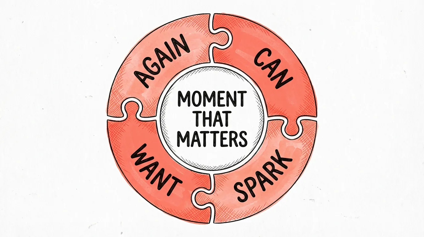
Pre-commitment at signup (SPARK - W19 Commitment/Consistency)
The moment of account opening is the single highest-motivation point in the entire user journey. The user has just decided they want to be financially better off. That motivation will not last. Use it immediately. Before the user closes the app, collect a savings commitment: an automatic round-up rule, a monthly auto-deposit, a payday transfer rule. Do not ask them to set this up later. Later is where intention goes to die. Acorns and Betterment both understood this: the default is always “start saving automatically,” and opting out requires active effort. Save More Tomorrow by Thaler and Benartzi shows the same principle works for future commitments: committing to save from a future pay rise feels far less costly than committing to save from today’s income, because future loss is more abstract.[6]
-
Smart defaults for investment (CAN - C01 Default, C02 Option reduction)
Auto-invest in a diversified portfolio as the default option. Present manual stock selection as an advanced feature, not the primary path. Most users who are given the choice between selecting individual stocks and auto-investing in a recommended portfolio will freeze and do nothing. Freeze is the enemy. Make the smart choice the easy choice. Opt-out instead of opt-in. Every moment of decision is an opportunity for inertia to win. Use the Endowed Progress logic: ensure the user leaves the onboarding feeling they have already started, not that there is still a choice they need to make later.
-
Loss aversion design (WANT - W05 Loss aversion, C16 Earmarking)
Design for how people actually process financial information, not how finance professionals assume they do. Show gains prominently and in emotional, narrative terms: “You’ve built €840 since March.” Show losses in long-term trajectory context: “Markets have recovered from every dip in history. Your 10-year goal is on track.” Reduce the default visibility of short-term portfolio fluctuations. Move the daily balance to a secondary screen. Make the long-term projection the first thing users see. Use earmarking: give money a name (emergency fund, holiday 2027, house deposit) so it feels already allocated to a goal, making it psychologically harder to spend.
-
Just-in-time financial education (SPARK - W31 Priming)
Regulatory financial education does not belong in a separate learning section. It belongs at the exact moment a user is about to make the relevant decision. When someone is about to buy their first bond, show a 20-second explanation of what a bond is and how it fits into their portfolio. This is the moment of maximum relevance. Comprehension is higher, retention is higher, and the education actually influences the decision it is meant to inform. Priming works: information that arrives directly before a decision has incomparably more influence than information that sits somewhere in a knowledge centre. This approach is also more effective for compliance purposes: education at the point of decision is demonstrably more likely to change behaviour than passive content provision.
-
Social comparison for savings goals (AGAIN - W01 Social proof, W14 Present bias)
People are powerfully motivated by what their peers do. Show anonymised peer savings data at the relevant moment: “People your age on this platform have saved an average of €6,200.” Use cohort comparisons carefully, not to shame but to normalise saving behaviour and create an achievable reference point. Richard Thaler’s Save More Tomorrow insight applies: pre-commit users to saving from future events (next payday, next bonus, next pay rise), not from current income. Future money feels less like a loss, which is exactly what present bias and loss aversion require you to design around. And for users who are already active: offer a commitment device in the spirit of Stickk.com, where they put something on the line to hold to their savings goal, making non-achievement a real, immediate loss rather than an abstract future regret.
Which cognitive biases matter most in fintech
Financial decisions are among the most cognitively loaded choices people make. They involve delayed rewards, probabilistic outcomes, social comparison, and deep emotional responses to loss. These are exactly the conditions under which cognitive biases have their strongest effect. As a fintech product, you can ignore these biases and fight them. Or you can understand them and design the product that works with them.
Present bias
Spending now feels concrete and real. Saving for retirement in 30 years feels abstract and distant. Present bias is why users sign up for a savings app and never make their first deposit. It is the single most powerful behavioural force in fintech.
Read the full analysis → Behavioural DesignLoss aversion
Transferring money to a savings account feels like losing it. Watching a portfolio fall triggers a panic response disproportionate to the actual risk. Loss aversion drives panic selling, avoidance of investing, and resistance to automatic deposits.
Read the full analysis → Behavioural DesignOptimism bias
Most people believe they will earn more in the future, save more next month, and be fine in retirement. This optimism defers financial action to an imaginary future self. The result: perennially low savings rates despite genuine intention.
Read the full analysis → Behavioural DesignAnchoring bias
The first number a user sees shapes every subsequent financial judgement. Presenting a suggested deposit amount, a peer savings average, or a projected balance anchors the user’s sense of what is reasonable. Fintech products that ignore anchoring leave enormous value on the table.
Read the full analysis → Behavioural DesignStatus quo bias
Users default to keeping their money where it is, doing what they have always done, and not changing financial behaviour even when change would clearly benefit them. Every opt-in design is a battle against status quo bias. Opt-out defaults win that battle decisively.
Read the full analysis →Frequently asked questions
What is behavioural design for fintech?
Behavioural design for fintech applies behavioural science to saving, investing, and financial decision-making. Instead of assuming users will act on their financial intentions, it maps the psychological forces that drive and block financial behaviour. Using the SUE | Influence Framework©, fintech companies identify why users sign up but never deposit, why investors panic-sell during dips, and why financial education content is ignored. The starting point is always the job: what does the user want done in their life, and how does the product stand in the way or make it easier?
Why do fintech users sign up but never activate their account?
Signing up and saving are two completely different psychological actions. Signing up requires only a moment of motivation. Saving requires overcoming present bias (spending feels good now, saving pays off later), loss aversion (transferring money feels like losing it), and inertia (doing nothing is always the easiest option). Most fintech products are optimised for sign-up conversion but leave the behavioural gap between registration and first deposit completely unaddressed. The fix is automatic defaults: round-up rules, payday auto-deposits, pre-commitment at signup, and a progress indicator that makes users feel they have already begun.
How does the SUE Influence Framework apply to fintech?
The SUE | Influence Framework© starts with the job the user wants done: financial security without daily active management. It then maps four forces: Pains (financial anxiety, peer comparison), Gains (freedom, control, future wealth), Comforts (spending is immediately rewarding, inertia is easy), and Anxieties (loss aversion, market panic, trust deficit). In fintech, the blocking forces consistently dominate: the comfort of spending now and the anxiety about loss are far stronger than abstract future gains.
Is gamification a good solution for fintech engagement?
Gamification drives engagement metrics but rarely drives financial behaviour. A streak for logging in daily does not close the gap between intention and saving. Behavioural design takes a different approach: instead of adding engagement mechanics, it removes friction between intention and action, sets smart defaults, and uses pre-commitment at the moments where users are most motivated. The goal is not more engagement with the app. The goal is better financial behaviour from the user. Those two things are not the same.
What is Save More Tomorrow and why does it matter for fintech?
Save More Tomorrow (SMarT) was designed by Richard Thaler and Shlomo Benartzi, published in 2004. Instead of asking employees to save more now (which triggers present bias and loss aversion), it asks them to commit today to saving a portion of future pay increases. Participants never feel the loss because they save from money they haven’t yet received. Savings rates quadrupled. In fintech, the same principle applies to round-up rules, payday auto-deposits, and pre-commitment flows at the moment of account opening, when motivation is highest and the future feels abstract enough that commitment feels costless.
PS
At SUE, our mission is to close the gap between what products promise and what users actually do. In fintech, that gap is widest. The product is not the problem. The problem is always the same: the product was designed for a rational user who does not exist. “People don’t resist change. They resist being changed.” Users want financial freedom. They do not want to be nudged every month to save. Design a product that does the job without them having to feel it. The moment you stop optimising the sign-up funnel and start designing for the job the user actually wants done, everything changes. The principles behind that are what we describe in The Art of Designing Behaviour (2024). The fintech industry has solved the technology problem. The behaviour problem is still waiting to be solved. That’s the opportunity. And it is a large one.