The most common sentence I hear from tech founders is: ‘The product is great. People just don’t use it.’
They’re usually right about the first part. The product is well-designed, the features solve a real problem, the UX is polished. And yet adoption stalls. Users sign up, explore for a week, and quietly disappear. Feature adoption sits at 3%. Re-engagement campaigns generate opens but not actions.
In every Behavioural Design Sprint I’ve done for tech companies, the diagnosis is the same. The team treats low adoption as a product problem and responds with more: more features, more onboarding steps, more push notifications, more re-engagement flows. But adding more doesn’t work when the problem isn’t what you built. The problem is how human behaviour works at the moment someone decides whether to come back tomorrow.
The missing variable is not the product. It is human behaviour. And the discipline that addresses it is called behavioural design.
Behavioural design for tech applies behavioural science to product adoption, user engagement, and digital experiences. Instead of building more features, it maps the psychological forces driving and blocking usage. Using the SUE | Influence Framework©, tech companies redesign onboarding flows, UX environments, and notification systems to work with human psychology, not against it.
The numbers behind the adoption gap
Why tech needs behavioural design
The tech industry operates on a seductive but false assumption: that better products produce better outcomes. Build the right feature, design a clean interface, and users will find their way to value. This is the product-first fallacy. It assumes users explore products with open minds and rational intentions. They don’t.
What they actually do is open an app while distracted, skip the onboarding because it feels like friction, use the two or three features they found in the first session, and never discover anything else. The mental model is set in the first few minutes. Everything after that is invisible unless it interrupts their existing pattern in a way that feels immediately relevant.
Clayton Christensen named the core of this problem with his Jobs-to-be-Done theory: people ‘hire’ a product to do a specific job - to make progress toward something they want in their lives.[5] Someone doesn’t buy a drill. They buy a hole in the wall. Someone doesn’t subscribe to a productivity tool. They hire it to feel in control of their workday again. The moment a product fails to deliver on that job quickly enough, the user disappears. Not because the product is bad, but because it never connected to the task they were trying to accomplish.
Google, Apple, Spotify, Netflix, Duolingo, Slack, Uber, LinkedIn. These companies have invested billions in understanding exactly this. Spotify’s Discover Weekly works not because the algorithm is better than competitors, but because it shows up at a predictable moment, creates a social conversation, and taps into the psychological need for identity expression through music. Duolingo’s streak mechanic is a commitment device that exploits loss aversion to keep users returning. These are not accidents. They are designed behaviours.
Simplicity eats willpower for breakfast.
- The Art of Designing Behaviour (2024)
This is what behavioural design does: it starts from the premise that behaviour is designable. Not by adding more features or more notifications, but by understanding the psychological forces at play and redesigning the environment at the moments where behaviour actually happens. As Tom de Bruyne and I describe in The Art of Designing Behaviour (2024), the principle is always the same: change the environment, not the user.
Three tech challenges that behavioural design solves
Challenge 1: the feature nobody clicked
At SUE we worked with a B2B SaaS company that had spent a quarter building a reporting module their largest customers had explicitly requested in user research. At launch, the feature was promoted in the app, included in the newsletter, and highlighted in the onboarding flow for new signups. Six weeks later, adoption was under 4% of the active user base. The product team’s response was to add a tooltip and a banner. Adoption didn’t move.
The real barrier was a combination of status quo bias (users had an existing workflow for their reporting, even if it was inferior) and choice overload. The product already had eleven navigation items. Adding a twelfth meant that discovering the new feature required a conscious decision to explore, which most users never made. The feature existed. It was just invisible to a brain running on autopilot.
Challenge 2: the onboarding that lost everyone
A productivity app had a 60% sign-up to day-one open rate, which is strong. But only 18% of users were still active at day 14. The onboarding sequence was eight screens long, asked users to set up five profile fields, connect an integration, and choose between three subscription tiers. The team had user-tested each screen. Each tested well in isolation. Together, they created a commitment demand that most new users were not ready to make.
This is the activation gap. Users sign up with genuine interest but haven’t yet formed a commitment to the product. Every additional step in onboarding is a decision point where they can silently quit. The onboarding sequence was designed to collect data and upsell, not to get users to their first moment of value as quickly as possible.
Research by Nunes and Dreze (2006) on the endowed progress effect shows exactly why this matters: people who are given an artificial head-start on a task complete it significantly more often.[6] A loyalty card that already has two stamps when you receive it gets completed at far higher rates than a blank card. The same principle applies to onboarding: show users at step 1 that they are already ‘40% done’, even before they have done anything.
Challenge 3: the engagement metrics that were destroying retention
A social platform was optimising hard for daily active users and session length. The team was proud of the numbers. What the dashboard didn’t show: an increasing proportion of users describing the product as addictive in a bad way, App Store reviews mentioning guilt and wasted time, and a correlation between highest-engagement users and highest churn six months later. The product was working exactly as designed. The design was the problem.
Dark patterns that manufacture engagement, infinite scroll that exploits present bias, notifications timed for maximum anxiety rather than genuine relevance. These tactics borrow engagement from the future by depleting the trust and goodwill that sustainable retention requires. The EU Digital Services Act is increasingly placing legal friction around these practices. But the more important signal was in the user data: the users they were optimising for hardest were the ones most likely to delete the app.
What users actually want from a tech product
Christensen’s Jobs-to-be-Done framework is the most practically useful lens I know for diagnosing adoption problems in tech. The premise: people don’t buy products. They hire products to make specific progress in their lives.[5]
For the tech sector, this means users hire a digital product for one of these core jobs:
- Productivity: reclaim the workday, meet deadlines, stop searching
- Connection: belong, collaborate, be visible to the right people
- Status: appear competent, use the right tools, keep up
- Control: maintain overview, avoid surprises, have everything in one place
- Entertainment: switch off from work mode, consume passively, find music or content
The problem is that most product teams design for the functional job and ignore the emotional and social jobs. And it is precisely those emotional and social jobs that bring users back every day. Spotify doesn’t deliver music. Spotify gives you an identity as a music lover. LinkedIn doesn’t give you a network. It gives you visibility within that network. Slack doesn’t give you a messaging system. It gives you the feeling of already belonging when you log in for the first time.
Once you know which job users are hiring your product for, you know when the first onboarding step needs to ‘click’, which features should be front and centre, and when a notification is welcome rather than annoying.
Influence Framework analysis: what drives and blocks product adoption
The SUE | Influence Framework© maps the four forces that determine whether users adopt a product, engage with a feature, or quietly churn. Applied to tech, the pattern is consistent: companies over-invest in addressing the driving forces (building better products, communicating more benefits) while leaving the blocking forces entirely untouched.
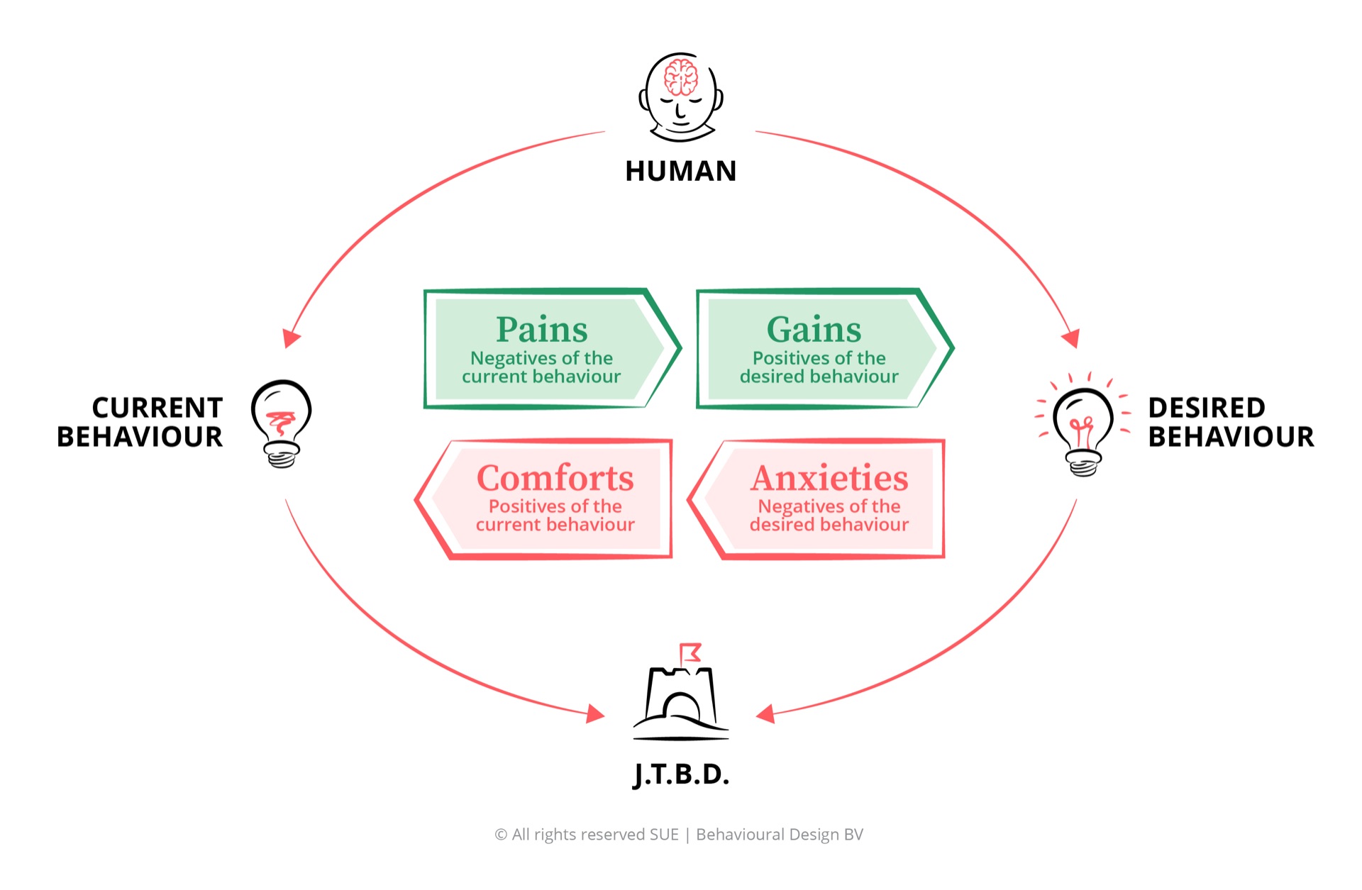
Why users don’t engage with products despite understanding their value
Tech marketing addresses the driving forces effectively. Users know your product is useful, modern, and efficient. What it almost never addresses are the blocking forces: the deep comfort of existing tools and habits, and the anxieties about learning something new. These are the forces that actually determine whether users adopt, activate, and retain.
Current tools feel slow and fragmented: Users are genuinely frustrated by the patchwork of tools they use. Manual workflows, copy-pasting between apps, version control chaos. For B2B users especially, this pain is felt daily and creates genuine openness to switching. But felt pain is not the same as felt urgency to act. The frustration is real. The step to action is not automatic.
Competitive pressure: Teams that are not using the right tools fall behind. In fast-moving industries, the fear of being outpaced by competitors who are using better products creates a real motivation to adopt. This is the force that makes tech products spread inside organisations, from power user to team to department.
Visible inefficiency: When a manager can see that a process is slow or error-prone, there is organisational pressure to fix it. The pain is external and legible, which makes it actionable in a way that personal frustration often is not.
More time for work that matters: The promise of a good productivity tool is time back. This is a genuine and attractive gain. The problem is that it is future-oriented and diffuse. Present bias means users systematically discount future efficiency gains in favour of the immediate familiarity of the current tool. The gain is real. It just doesn’t feel urgent.
Professional identity and status: Using the right tools is part of professional identity in tech. LinkedIn posts about workflow setups, Notion templates shared on X, Slack admins as de facto power users. The product can become part of how someone signals their competence and belonging to a professional tribe. This is the emotional Job-to-be-Done behind much of tech adoption.
Reduced cognitive load: When a tool genuinely consolidates what used to require multiple apps, the relief is real and immediate. This is the strongest gain, and it is also the hardest to communicate before a user has experienced it. That is precisely why onboarding must make it felt, not described.
Current tools work well enough: The status quo is comfortable not because it is optimal, but because it is automatic. Users know exactly where to find things, how to do their tasks, what the keyboard shortcuts are. Switching to a new tool means temporarily becoming less competent, and most people avoid that feeling even when the long-term gain is obvious. Barry Schwartz showed that more choice does not lead to better decisions, but to less decision-making - and this comfort of the familiar is the core of that mechanism.[7]
Vanity metrics feel like progress: For product teams, optimising for clicks and engagement numbers is comfortable because it produces daily evidence of work. Addressing deeper behavioural barriers is slower, harder to measure, and requires admitting that previous assumptions were wrong. The comfort of metric-driven iteration blocks the harder diagnostic work.
Dark patterns generate short-term results: Manipulative design choices work immediately. The notification that drives a re-open, the dark pattern that prevents cancellation, the gamification that inflates DAUs. These produce numbers that look like success. They block the harder work of designing for genuine value.
Learning curve and switching costs: Any new product requires an investment of time and cognitive effort before it delivers value. This is the activation anxiety. “What if I spend two weeks learning this and it turns out not to be the right tool?” This anxiety is rational but tends to be overcalculated. Endowment effect makes the current tool feel more valuable than it objectively is, which means perceived switching costs are always higher than actual ones.
Data portability and lock-in: Enterprise users worry about migrating data, about what happens if the company pivots or gets acquired, about dependencies that will be painful to unwind. This anxiety is particularly strong for tools that become deeply embedded in workflows. It needs to be explicitly addressed in the adoption journey, not ignored.
Ethical design concerns: Increasingly, sophisticated users are anxious about the behavioural design of the products they use. Notifications designed to create anxiety. Feeds designed to maximise time spent rather than value delivered. This anxiety is making users more sceptical of engagement mechanics that would have gone unnoticed five years ago.
The key insight: Tech products invest heavily in the driving forces: building better features, writing clearer value propositions, communicating benefits in onboarding. But user adoption is determined by the blocking forces, which are almost entirely environmental. The comfort of existing habits and the anxiety about switching costs are not overcome by better feature documentation. They are overcome by redesigning the moments where adoption decisions actually happen, reducing friction at the critical threshold, and making the desired behaviour easier and more immediately rewarding than the default.
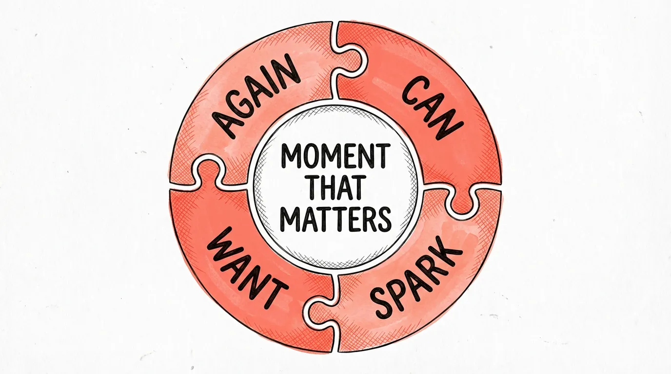
Five behavioural interventions for tech products
-
Smart defaults in onboarding (CAN - C01: redesign defaults)
The single highest-leverage behavioural intervention in any digital product is the default. What is pre-selected? What is the starting state? Most tech products default to blank canvases that require users to make ten decisions before experiencing any value. Redesign defaults so the product is immediately useful without configuration. Spotify defaults to curated playlists. Slack defaults to suggested channels. LinkedIn defaults to a completed profile prompt sequence. These are not accidents. They are defaults designed to get users to value before they have time to abandon. And it works: Amazon increased revenue by $300 million per year simply by changing the text on one button.[3]
-
Progressive disclosure to reduce cognitive load (CAN - C13: chunking)
Every feature visible on a screen that a user does not need right now is cognitive noise that makes the features they do need harder to find. Decision fatigue is real in product interfaces: the more choices visible at once, the more likely a user is to choose none. Progressive disclosure means showing users only what they need at each stage of their journey, revealing more only when they have demonstrated readiness. This is how Duolingo introduces grammar concepts, how Notion introduces database features, and how Uber reduced their redesign cancellation rate by 15% by hiding complexity behind a single primary action.
-
Social proof integration (WANT - W08: descriptive social norm)
Users trust what other users do more than what product teams say. “87% of teams your size use this feature” is more effective than any benefit statement in a tooltip. Social proof works by reducing the activation anxiety: if other people like me are doing this, it is probably safe and valuable to do too. Embed real usage data into the product at the moments of lowest confidence. Show new users what successful users look like. Netflix uses this to drive content engagement. LinkedIn uses it to nudge profile completion. The mechanism is the same: make the desired behaviour look like the normal thing to do.
-
Friction for harmful paths (CAN - C19: protective friction)
Not all friction is bad. Behavioural design uses friction deliberately to slow down actions that users might regret. Deleting an account, cancelling a subscription, ignoring a security setting. Slack adds a confirmation step before leaving a workspace. Gmail adds a delay to sent emails. Apple’s Screen Time requires a PIN to override limits a user has set for themselves. These are not dark patterns; they are ethical design choices that add protective friction where users themselves would want to pause. The principle is the opposite of the dark pattern: use friction to protect the user, not to manipulate them.
-
Commitment devices in UX (AGAIN - C22: pre-commitment)
A commitment device is a choice that people make in advance to constrain their future behaviour in a way they believe will serve them better. In tech products, they are among the most powerful retention tools available, and the most underused. Duolingo’s streak is the obvious example: users who set a learning goal and track their streak are dramatically more likely to return than those who don’t. Spotify’s year-end Wrapped is a commitment device that makes users feel invested in their listening history. The design principle: give users a way to make a small public or private commitment to a behaviour pattern they want, and then make keeping that commitment easier than breaking it.
Which cognitive biases matter most in tech products
User behaviour in digital products is shaped by the same cognitive biases that operate in every other domain. But in tech, these biases are both the problem and the toolkit. Here are the five that have the most impact on product adoption, engagement, and retention.
Status quo bias
Users stick to existing workflows not because they are better, but because they are automatic. Status quo bias is the single biggest barrier to feature adoption. The solution is not to make the new feature better. It is to make switching away from the current behaviour the path of least resistance.
Read the full analysis → Behavioural DesignDecision fatigue
Every choice in your onboarding flow depletes the cognitive resource that users need to reach value. Products that ask users to make ten decisions before experiencing anything useful are designing for decision fatigue. The fix is progressive disclosure and smart defaults.
Read the full analysis → Behavioural DesignSocial proof
Users trust what other users do more than what product documentation says. Embedding social proof at the moments of highest uncertainty, sign-up, feature discovery, upgrade decisions, is one of the most consistently effective interventions in digital product design.
Read the full analysis → Behavioural DesignFraming effect
“You’ve completed 3 of 5 setup steps” and “You’re 40% away from being fully set up” describe the same state. The first drives completion. The second drives abandonment. How you frame progress, risk, and value in your UX copy determines which behaviour users choose.
Read the full analysis → Behavioural DesignEndowment effect
Users overvalue what they already have. Their current tool, their existing data, their configured workflows. Endowment effect inflates perceived switching costs beyond their rational value. Understanding this bias changes how you design trial experiences, data portability, and migration flows.
Read the full analysis →Frequently asked questions
How does behavioural design apply to tech products?
Behavioural design for tech maps the psychological forces that determine whether users adopt features, complete onboarding, and stay engaged over time. Instead of assuming users will explore a product rationally, it diagnoses the specific status quo bias, choice overload, and friction points blocking adoption. The SUE | Influence Framework© then guides the redesign of onboarding flows, defaults, and UX environments to work with how users actually behave.
Why do users not adopt new features even when they are well-designed?
Feature non-adoption is almost never a design quality problem. It is a behavioural problem. Users hire products for a specific Job-to-be-Done. A new feature that does not connect to that job, or is introduced at the wrong moment, gets ignored regardless of how good the UX is. Status quo bias means the default is always to keep doing what you were doing. Without a precisely timed contextual trigger, most users will never find the feature, let alone integrate it into their workflow.
What is the difference between UX design and behavioural design in tech?
UX design focuses on usability: making interactions intuitive and friction-free. Behavioural design goes deeper: it asks why users behave the way they do, which psychological forces are driving and blocking the desired behaviour, and how the environment can be redesigned to make the desired behaviour the default. Behavioural design uses the Influence Framework to diagnose behaviour before designing the intervention. UX often skips the diagnosis.
How do tech companies use dark patterns and what is the alternative?
Dark patterns are design choices that manipulate users into actions they would not consciously choose: hidden cancellation flows, misleading notifications, infinite scroll that exploits present bias. They work short-term but erode trust, increase churn, and attract regulatory scrutiny under the EU Digital Services Act. The behavioural design alternative is transparent nudging: redesigning defaults and choice architectures to make genuinely valuable behaviour easy, without exploiting psychological vulnerabilities.
Can behavioural design reduce app churn and improve retention?
Yes. Most app churn happens in the first week, driven by a failure to activate users on the core value proposition before habit is formed. Behavioural design addresses this by redesigning the activation moment: progressive disclosure that reduces initial cognitive load, implementation intentions that help users commit to a usage pattern, and social proof that shows new users what success looks like. The endowed progress effect (Nunes and Dreze, 2006) shows that an artificial head-start in onboarding can increase completion rates by up to 34%.
PS
At SUE, we work with tech teams who are genuinely doing excellent work. The engineering is tight, the UX is thoughtful, the product strategy is clear. And users still aren’t doing the thing the product was designed for. That frustration is real. But the cause is never the team or the product. The cause is a product built for rational actors who don’t exist. The moment you stop asking “how do we communicate the value better?” and start asking “what is the psychological environment users are actually in when they make this decision, and what job are they hiring us for?” everything changes. That is the core of what we do at SUE, and what Tom de Bruyne and I describe in The Art of Designing Behaviour (2024). Tech doesn’t need more features. It needs better behavioural design.