Nudge marketing: what works, what backfires and where the line is

Somewhere in your funnel there is a pre-ticked box, a "most popular" badge, or a counter telling visitors that four other people are looking at this room. Someone added it because it worked. Nobody has asked lately whether it still does, or what it costs you when a customer notices.
That is the state of nudge marketing in most companies. A drawer of tactics borrowed from a conference talk, applied without a diagnosis, defended with a conversion uplift that was never properly measured.
It deserves better, because the underlying idea is one of the most useful things behavioural science has given commerce. It is also one of the easiest to abuse.
Nudge marketing is the commercial application of choice architecture: changing how a purchase decision is presented so the easiest option is also a good one for the customer, without removing alternatives or changing the price. It stops being a nudge, and starts being a dark pattern, the moment it only works while the customer fails to notice it. More on nudging and how it works →
What is nudge marketing?
The word comes from Richard Thaler and Cass Sunstein, who defined a nudge in 2008 as any aspect of the choice architecture that alters people's behaviour in a predictable way without forbidding any options or significantly changing their economic incentives.[1] Two clauses in that sentence do all the work. Nothing is taken away. Nothing gets more expensive.
Apply that to marketing and the definition narrows usefully. Discounting is not a nudge, because it changes the incentive. A sales team calling every lead twice is not a nudge, because it changes the effort, not the architecture. Putting the annual plan next to the monthly one with the yearly saving shown in the same currency, that is a nudge. So is defaulting a returning customer's order to their last delivery address.
Which also explains why so much of what marketers call nudging is not. A persuasive headline is copywriting. A discount is pricing. A push notification is a reminder. Those can all be effective. They are simply not the same instrument, and confusing them is why teams conclude that "nudging doesn't work for us" after testing something that was never a nudge. If you want the broader mechanics first, start with what nudging is and how it works.
A nudge changes the architecture of the choice. Everything else changes the price, the pressure or the promise.
Why nudges work on customers who think they are deciding
Your customer is not weighing your value proposition. They are scanning, and they are doing it with the fast, automatic thinking Daniel Kahneman called System 1: pattern-matching, effort-avoiding, exquisitely sensitive to how something is presented rather than what it contains.[2]
That is not a flaw to be corrected. It is the operating condition of every commercial decision, and it means presentation is not the wrapping around the offer. Often it is the offer, as far as the decision is concerned.
The clearest demonstration in the literature has nothing to do with marketing. Eric Johnson and Daniel Goldstein compared organ donor registration across European countries in 2003. Where citizens had to tick a box to become a donor, effective consent ranged from roughly 4 to 28 per cent. Where donation was the default and citizens had to tick a box to opt out, it ranged from about 86 to almost 100 per cent.[3] Same continent, same values, same form. One word moved on the page.
No commercial default will ever be that powerful, because buying a sofa is not the same as a policy question you have never considered. But the direction holds, and it explains why the single most valuable question in nudge marketing is rarely asked out loud: what happens if the customer does nothing? Whatever the answer is, that is your real proposition.
Four nudges with real evidence behind them
Not every nudge is equal. In a review of more than a hundred studies, Dennis Hummel and Alexander Maedche found that roughly six in ten reported nudge effects were statistically significant, with defaults consistently among the strongest instruments and pure information provision among the weakest.[4] That ratio is a warning and a shopping list at once. These four earn their place.
1. The default
Whatever is already selected wins disproportionately, for the reason above. In marketing that means the delivery option you pre-select, the plan length that loads first, the quantity in the basket. The discipline is to choose the default that is right for the majority of customers, not the one with the highest margin. Get that backwards and you have converted a nudge into a complaint queue.
2. The descriptive norm
Noah Goldstein, Robert Cialdini and Vladas Griskevicius tested hotel towel cards across guest rooms. A card reporting that the majority of guests reuse their towels lifted reuse from roughly 35 to 44 per cent compared with a standard environmental appeal, and a card naming the guests in that same room did better still.[5] The mechanism is not flattery. It is information about what people like me do here.
Which is exactly why an invented "1,200 people bought this today" destroys the effect it borrows. Descriptive norms work because they are read as evidence. Once a customer suspects the number is decorative, the whole page loses that status.
3. Removing friction from the desired step
Most conversion problems are not motivation problems. They are a form with eleven fields, a login demanded before checkout, a delivery cost that only appears at step four. Every one of those is a decision point where System 1 can quietly leave. Counting the steps between intent and completion is unglamorous work, and it usually beats any amount of persuasion added on top.
4. Adding friction to the regrettable step
The one marketers forget. A confirmation screen before an expensive upgrade, a size guide that interrupts an order likely to be returned, a "are you sure this is the right plan for you?" It reduces short-term conversion and improves the number that actually pays your salary: customers who stay.

Where nudge marketing turns into a dark pattern
Harry Brignull named the other side of this craft in 2010: dark patterns, interfaces built to trick people into decisions they did not intend to make.[6] The uncomfortable truth is that dark patterns use the same psychology as nudges. Defaults, urgency, social proof, friction. The technique is identical. The intent is not.
They are also not rare. Arunesh Mathur and colleagues at Princeton crawled roughly eleven thousand shopping sites and identified 1,818 instances of dark patterns across more than a thousand of them, from countdown timers that reset on refresh to sneaked items in baskets.[7] This is not a fringe practice. It is the industry standard in several categories.
And it works, in the short run. Jamie Luguri and Lior Strahilevitz ran an experiment on a large sample of American consumers: mild dark patterns more than doubled the proportion who accepted a dubious paid subscription, and aggressive ones nearly quadrupled it. But the aggressive versions also produced measurable consumer anger and complaint.[8] You buy the conversion with trust, and the invoice arrives later.
So where is the line? Sunstein proposed the most workable test, in the form of a transparency principle: a legitimate nudge is one you could announce publicly without undermining it.[9] Try it on your own funnel. "We put the annual plan first because most customers save money on it" survives being said out loud. "We made the cancel link grey and put it three screens deep" does not.
Regulators have arrived at roughly the same place. The EU Digital Services Act bars online platforms from designing interfaces that deceive or manipulate users into decisions they would not otherwise take, and national consumer authorities are increasingly acting on fake scarcity and obstructed cancellation. The ethical argument and the legal one now point the same way, which is convenient, if slightly late.
The forces behind the purchase decision
The reason most nudge marketing disappoints is sequencing. Teams pick the tactic before they understand the decision. The SUE | Influence Framework forces the other order, by mapping the four forces around a choice: pains, gains, anxieties and comforts.[10]
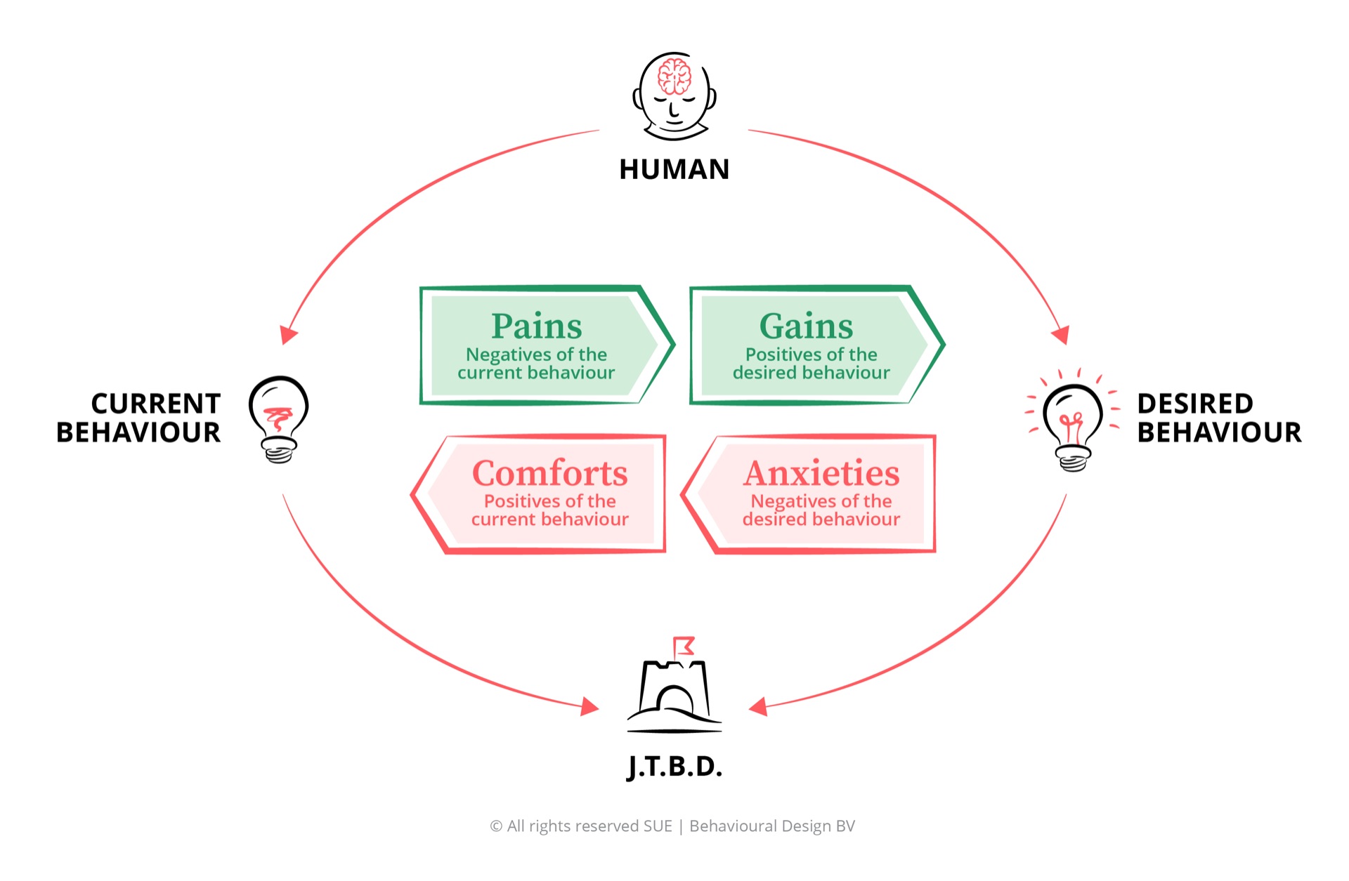
The pains push the customer towards you: the thing that is not working, the deadline, the irritation with the current supplier. Marketing usually understands these well, because they are what the campaign talks about.
The gains pull them forward: the outcome they want, the version of themselves they are buying. Also well covered, sometimes over-covered.
The anxieties are where nudges earn their keep, and where most funnels are silent. Will this fit? What if it is wrong? How hard is it to return? Is this company real? Every one of those is a hesitation you can design against with a guarantee stated at the decision point, a returns policy shown before the button rather than in the footer, a norm that tells them who else made this choice.
The comforts are the quiet force that keeps customers with a supplier they complain about. Doing nothing is free, familiar and requires no defence to anyone. This is what a well-chosen default is competing with, and usually losing to.
Map those four before you design anything, and the nudge selects itself. Skip the map, and you are decorating.
How to design a nudge that survives scrutiny
Four questions, in order, before anything ships.
What is the one behaviour? Not "increase conversion". A specific action by a specific person at a specific moment: a first-time visitor completing the address field, an existing customer renewing before expiry. Vague targets produce vague interventions.
Which force is actually blocking it? From the map above. If the blocker is an anxiety about fit, a countdown timer is not just unethical, it is the wrong tool, and it will underperform even on its own terms.
Would you say it out loud? The transparency test, applied before launch rather than after the press coverage. Write the sentence you would use to explain the mechanism to the customer. If you flinch, redesign it.
How will you know? Test it against a real control, measure beyond the click, and look at the metric downstream: returns, cancellations, complaints, repeat purchase. A nudge that lifts checkout by four per cent and lifts refunds by six has cost you money and goodwill in a single move.
Frequently asked questions about nudge marketing
What is nudge marketing?
Nudge marketing is the use of choice architecture in a commercial setting: changing how options are presented so the easiest path is also a sensible one for the customer. Following Thaler and Sunstein's 2008 definition, a nudge must keep every alternative available and must not meaningfully change the price. Highlighting a plan that fits most people is a nudge; hiding the cancel button is not.
What is the difference between a nudge and a dark pattern?
The transparency test. A nudge still works when you explain it out loud: most people choose this plan, so we put it first. A dark pattern only works while it is hidden, because it relies on the customer misreading the interface. Harry Brignull, who named dark patterns in 2010, defines them as design that tricks users into decisions they did not intend. Nudges make a good choice easier; dark patterns make a bad choice harder to avoid.
Do nudges actually increase conversion?
Some do, dramatically, and many do not. In a review of over one hundred nudging studies, Dennis Hummel and Alexander Maedche found that roughly six in ten reported effects were statistically significant, with defaults among the most reliable and reminders or information provision among the weakest. The mechanism matters far more than the label, which is why how you design the nudge decides whether it moves anything.
Is nudge marketing legal in the EU?
Nudging itself is legal; deceptive design increasingly is not. The EU Digital Services Act explicitly prohibits online platforms from designing interfaces that deceive or manipulate users into decisions, and consumer authorities across Europe now act on misleading scarcity claims and obstructed cancellation flows. If your growth depends on a customer not noticing something, treat it as a legal risk as well as a brand risk.
Conclusion
Nudge marketing is not a bag of tricks, and the companies treating it as one are the reason the term now carries a faint smell. It is a design discipline with a specific claim: that the structure of a choice shapes the choice, and that structure is something you control.
Use it to remove the obstacles between a customer and a decision they will be glad they made, and it compounds. Use it to extract a decision they would not have made with the lights on, and it also compounds, in the other direction.
The test is not complicated. Say what you did out loud. If it still works, it was a nudge.
Want to design nudges from a diagnosis instead of a checklist? The Art of Influence© online teaches you the full method, from mapping the forces around a decision to choosing and testing the intervention. 33 lessons, at your own pace, rated 9.3/10 by more than 10,000 professionals.