How do you design a shop where people buy less, and walk out happier?
How do you design a shop where people buy less, and walk out happier? It sounds like a contradiction. Every instinct in retail runs the other way. More in the basket, higher at the till, repeat next week. And yet there is a market hall in Italy that built its whole reputation on the opposite, and it has been copied across the world precisely because it works.
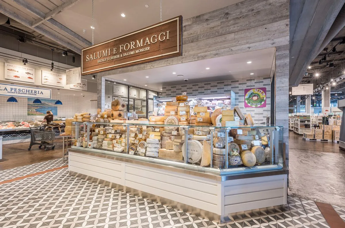
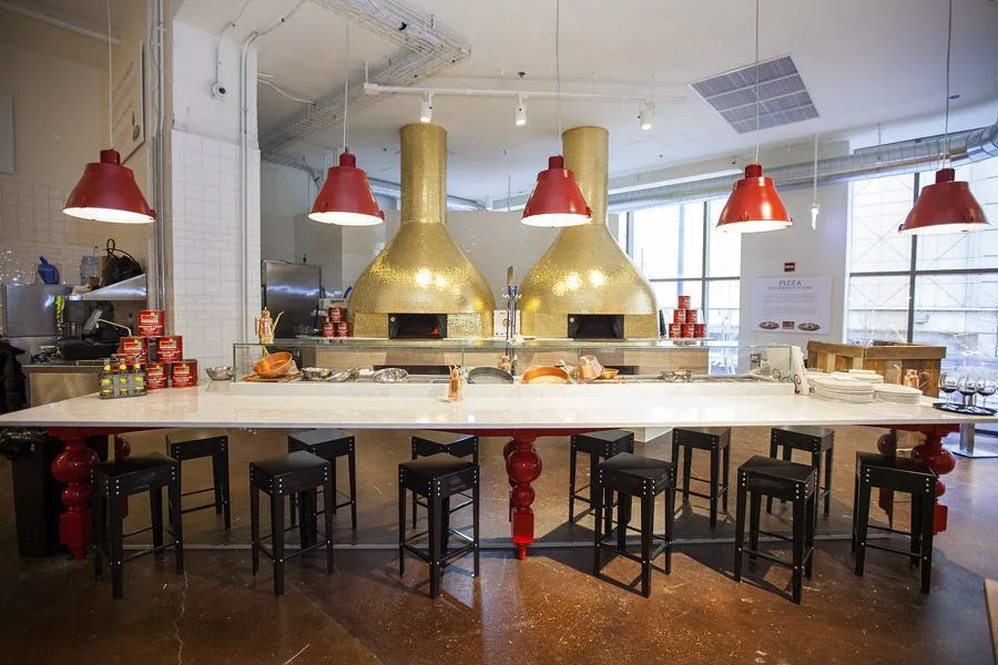
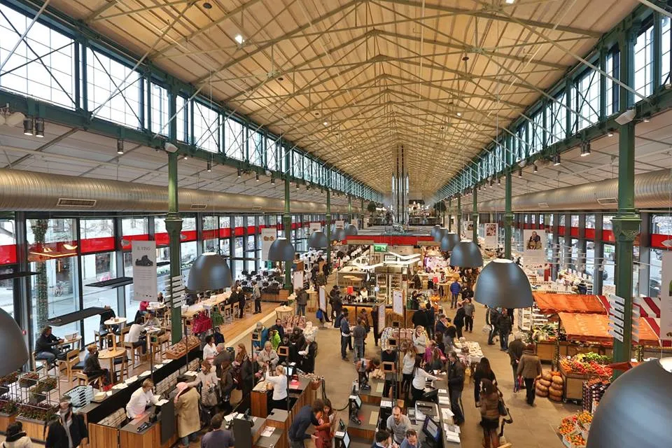
Start with the picture, because the picture does most of the work. Wooden stalls. Open kitchens where you can watch the pasta being rolled. A cheesemaker who stops to explain what is ageing on the shelf behind him. People stand still. They look, they ask, they taste. They are not rushing the aisles with a list and a clenched jaw. And at the checkout, something unusual happens: they are pleased with what is in their basket. Not vaguely satisfied. Actually pleased.
This is Eataly. And it is one of the clearest pieces of behavioural design in modern retail, hiding in plain sight as a nice place to buy cheese.
The shop that decided to be a market
The conventional retail playbook is well known and ruthlessly effective. Optimise the shelves. Build the loyalty programme. Add healthier ranges so the assortment looks responsible. Move the staples to the back so people walk past everything else to reach the milk. Light the aisles so the produce glows. Time the music so the pace of the store matches the pace of spending.
Supermarkets are arguably the most sophisticated behavioural design on earth. Every shelf, every walking route, every lighting setting is tuned so you buy more than you meant to. The trouble is that all of it serves a single outcome, and it is the wrong one. The store wins at the till. The shopper loses a little something they cannot name, and often regrets part of the basket by the time they unpack it at home.
Eataly's founder looked at this and asked a different question. Not how do we sell more, but what kind of place is a supermarket in the first place? His answer was blunt. A supermarket is a place of haste, of no information, of no people. A market is a place where you exchange not just products but culture. So he built the market. Stalls instead of shelves. Makers instead of staff in branded fleeces. Tasting instead of sampling stations bolted on as an afterthought.
The result is a space where people slow down on purpose. And when they slow down, their relationship with what they are buying changes. They understand where the food comes from. They have handled it, asked about it, watched it being made. They buy with attention rather than on autopilot. And attention, it turns out, is what protects people from regret.
Why this is design, not motivation
It is tempting to file Eataly under atmosphere. Nice lighting, good story, pleasant afternoon out. But that misreads what is actually happening, and the misreading matters, because it is the difference between something you can copy and something you can only admire.
Eataly does not motivate people to shop mindfully. Nobody hands you a leaflet at the door urging you to reconnect with your food. There is no campaign, no nudge in the moralising sense, no sign telling you to slow down and appreciate the provenance of your pecorino. The slowing down is built into the room. The stalls are spaced so you stop. The open kitchens give you something to watch, so you linger without being told to. The maker explaining the cheese is not a marketing tactic bolted on top of a normal shop; he is the shop.
That is the line that separates behavioural design from motivation. Motivation asks people to want something different. Design changes the situation so the wanting takes care of itself. You can stand in a regular supermarket and tell yourself to shop with intention, and you will still leave with three things you did not plan to buy, because the whole environment is pulling the other way. Put the same person in Eataly and they shop with attention without any effort at all, because the room is built for it.
The behaviour was never really inside the shopper. It was in the architecture of the place. At SUE, the Influence Framework and SWAC are the methods we teach in the Behavioural Design Fundamentals Course to systematically analyse how placement and salience shape behaviour before any conscious decision is made.
 Amsterdam
Rated 9.3 out of 10. Certificate included.
The principle: elaboration and product attachment
The mechanism underneath this has a name in consumer psychology, and naming it is what turns a charming anecdote into something you can apply on a Tuesday.
When people have more information about a product - its origin, its story, how it was made - they process it more deeply. That deeper processing is called elaboration. And elaboration changes the relationship. A wheel of cheese you watched being cut, from a maker who told you which hillside the milk came from, is no longer interchangeable with any other wheel. You have attached something to it. Researchers studying product attachment and post-purchase behaviour have found that this deeper engagement tends to track with higher satisfaction after the purchase and less regret, fewer of those quiet moments of buyer's remorse where you wonder why the thing felt better in the shop than it does at home.
This is the quiet engine under Eataly. The store is not engineered to extract the maximum from each visit. It is engineered so that people elaborate on what they buy, which means they buy fewer things they will regret and feel better about the things they keep. The basket may be smaller. The satisfaction is larger. And satisfied customers, unlike merely persuaded ones, come back without being chased.
It is worth noticing how counterintuitive this is from a spreadsheet point of view. The open kitchens take up floor space that could hold more product. The maker explaining the cheese is slower than a self-service shelf. The pauses built into the layout reduce throughput, which on paper looks like lost revenue per square metre. Every one of these choices looks inefficient if you measure the wrong thing. What they buy is a relationship between the shopper and the product that no efficient shelf can manufacture, and that relationship is what brings the customer back and keeps them spending over years rather than minutes. The inefficiency is the investment.
Behaviour follows the room, not the willpower of the person standing in it. Change what the room asks of people, and you change what they do.
Learn to apply this yourself
What makes Eataly effective is not its aesthetic but its structure: the physical environment is designed so that elaboration happens automatically, which means people form genuine attachment to what they choose before they even reach the checkout. In the Behavioural Design Fundamentals Course you learn to map these structural conditions using the Influence Framework and SWAC, so you can apply the same logic to any retail, service, or digital environment you design.
View the Behavioural Design Fundamentals CourseWhat you can design this week
You do not need a market hall in Milan to use any of this. The principle travels, because it is about attention and information, not about wooden stalls. Here is where to start:
Build in a reason to slow down. Most shops, services and digital flows are optimised for speed and throughput. Ask where you actually want people to pause, and then give them something there worth pausing for. An open kitchen, a maker, a short story about origin, a moment of genuine information. Speed is not always the goal. Sometimes the pause is the whole point.
Give people something to elaborate on. Before adding another discount or display, ask whether the customer knows anything about what they are choosing. Where it came from, who made it, why it is the way it is. The more someone processes a product, the more they attach to it, and the more satisfied they tend to be afterwards. Information is not friction. It is the thing that makes the choice stick.
Optimise for the checkout feeling, not the checkout total. The most useful question is not how much went in the basket, but how the person feels about the basket as they pay. Regret is expensive. It shows up later as returns, as silence, as customers who never come back and never tell you why. A slightly smaller basket that the customer is happy with beats a fuller one they half regret.
If you want to learn how to design for behaviour rather than trying to motivate it, that's exactly what the Behavioural Design Fundamentals Course covers. View upcoming dates →
Frequently asked questions
What is Eataly and why is it different from a supermarket?
Eataly is an Italian food market concept now present in cities around the world. Unlike a supermarket, it is organised as a collection of market stalls with open kitchens, visible makers and staff who can explain the products. The design slows shoppers down deliberately, which increases product attachment and tends to result in smaller but more satisfying baskets.
What is elaboration in consumer psychology?
Elaboration refers to the depth of cognitive processing a person applies to a product. When someone processes a product more deeply - learning its origin, watching it being made, hearing the story behind it - they form stronger attachments to it. Higher elaboration is consistently associated with greater post-purchase satisfaction and less buyer's remorse.
How does Eataly relate to behavioural design?
Eataly is a textbook example of designing behaviour rather than demanding it. Instead of urging customers to shop mindfully, it builds a physical environment in which mindful shopping is the natural result. The layout makes people stop, the open kitchens give them something to observe, the makers give them something to ask. The behaviour is in the architecture, not in the willpower of the shopper.

1.5 minutes on influence
Join 6,500+ readers · Free · Unsubscribe anytime